# Bootstrap Alerts
An "Alert" dialogue box is displayed to the user for displaying some text of any length.
Programmer can add an optional close button for dismissal.
Bootstrap presents 8 styles of alert dialog boxes for different contexts .alert-success, .alert-info, .alert-warning or .alert-danger etc.
Alerts are created with the .alert class, followed by one of the 8 contextual classes.
Example
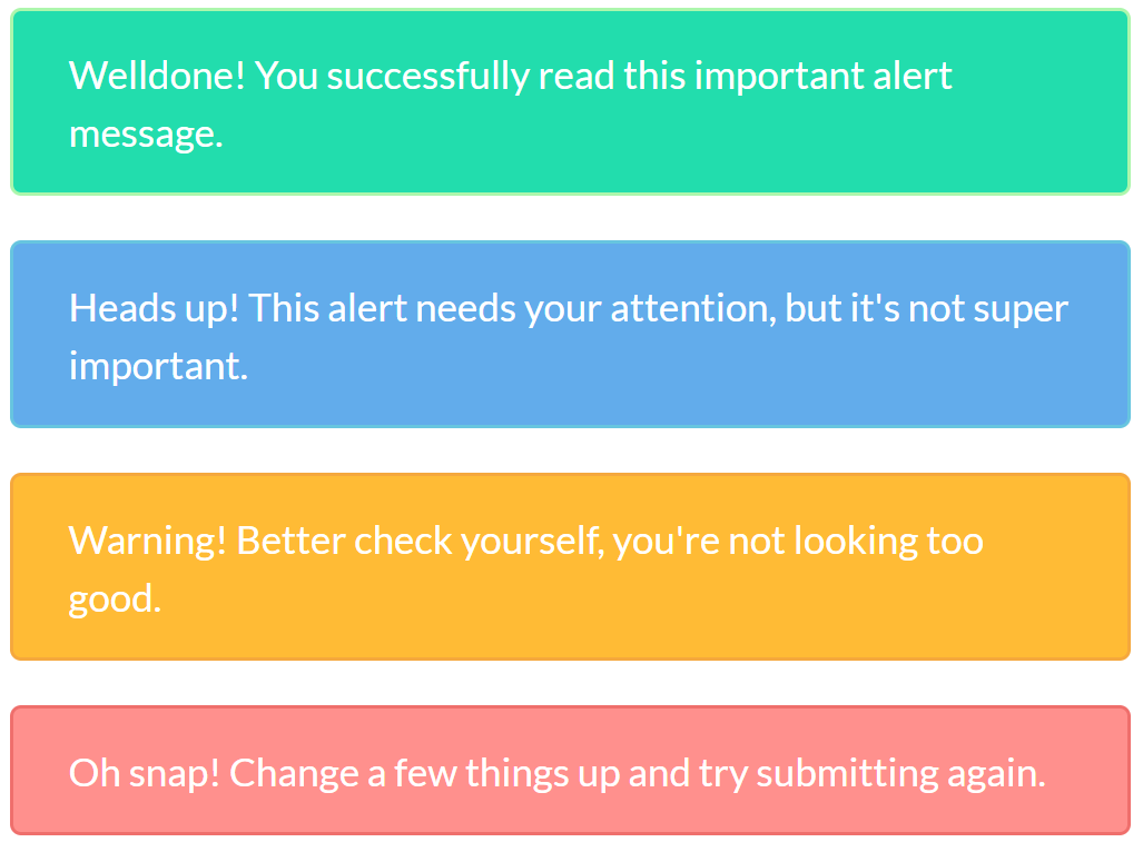
<div class="alert alert-success">
   <span>Welldone! You successfully read this important alert message.</span>
</div>
<div class="alert alert-info">
   <span>Heads up! This alert needs your attention, but it's not super important.</span>
</div>
<div class="alert alert-warning">
   <span>Warning! Better check yourself, you're not looking too good.</span>
</div>
<div class="alert alert-danger">
   <span>Oh snap! Change a few things up and try submitting again.</span>
</div>
# Dismissable Alerts
For inline dismissal, you can add alert-dismissable attribute to your div tag then invoke it through a button like
<div class="alert alert-success alert-dismissable">
<button type="button" class="close" data-dismiss="alert" aria-hidden="true">×</button>
<span>Welldone! You successfully read this important alert message.</span>
</div>
Note: Do not forget to use <button> tag with attribute data-dismiss="alert".
Note: Alerts can be easily displayed in different styles using extra HTML tags like <H3>, <P> and <SEC> etc.